12 Salesforce Analytics That Every Sales Manager Needs

Most Sales Managers know that Salesforce has much more to offer than what their organizations are currently getting.
Despite having access to countless reports, critical questions about the sales pipeline—its size, quality, and trends—are often going unanswered or requiring unnecessary acrobatics in Excel to uncover.
This lack of clarity limits a managers' ability to forecast effectively, coach teams, boost performance, and ultimately hit targets.
If that sounds familiar, you’re in the right place. Here’s the ultimate guide to the 12 Salesforce dashboard charts that you should consider adding to your home page.
Table of Contents:

1. Closed Won Opportunities by Month
Overview
This chart tracks revenue won by the sales team each month, delivering a clear snapshot of performance trends. The X-axis represents the Opportunity Close Date, the Y-axis shows the total Revenue Amounts, and groupings can be made using fields like Opportunity Owner, Team, Territory, or Region.
Pain Points Solved
Tracking Performance Trends Over Time: Managers can instantly see if revenue performance is meeting goals month-over-month.
Identifying Underperformers: The chart helps pinpoint individuals or teams that may need coaching or support.
Evaluating Strategy Success: By comparing past months, you can assess how new sales strategies or campaigns impact outcomes.

2. Pipeline Deals by Close Date and Opportunity Stage
Overview
This chart is one of the most powerful tools for pipeline management. It shows the value of deals due to close each month, grouped by Opportunity Stage. The X-axis is based on Opportunity Close Date, while the Y-axis tracks Opportunity Values.
Pain Points Solved
Forecasting Revenue: Offers a clear view of pipeline maturity and whether current deals align with sales targets.
Highlighting At-Risk Deals: Reveals deals stuck in early stages, which might need immediate attention.
Balancing Long-Term and Short-Term Efforts: Provides early warnings about future pipeline gaps or shortfalls.

3. The Sales Funnel
Overview
The funnel chart visualizes pipeline health by tracking how deals progress through each stage of the sales cycle. The Opportunity Stage field determines each level of the funnel, and the height of the funnel bars correlates with Opportunity Values.
Pain Points Solved
Spotting Imbalances: Uneven funnel shapes (e.g., large middle-stage deals but few early-stage ones) highlight pipeline inefficiencies.
Evaluating Stage Movement: Identifies bottlenecks in how quickly deals move from one stage to another.
Preventing Long-Term Declines: Alerts managers to stages where marketing or qualification improvements are needed.

4. Top 10 Pipeline Accounts
Overview
This chart ranks your key customers and prospects by total pipeline value, helping to prioritize high-value accounts. The X-axis lists Account Names, the Y-axis visualizes their total Opportunity Value, and the chart groups by Account fields.
Pain Points Solved
Focusing on High-Impact Deals: Ensures sales efforts are directed at top opportunities with the most potential.
Strengthening Key Relationships: Tracks key accounts that may require additional executive involvement.
Prioritizing Resources: Prevents spreading resources too thin by concentrating efforts where they have the highest ROI.

5. Long-Term Pipeline Trend
Overview
This chart tracks the evolution of the pipeline by examining Opportunities based on their Created Date. For the X-axis, it uses Opportunity Created Date, the Y-axis represents Pipeline Values, and the chart shows stage distribution using Opportunity Stage.
Pain Points Solved
Monitoring Growth: Helps managers see if the pipeline is expanding or if efforts need reinforcements.
Understanding Stage Mix: Highlights changes in the distribution of deals across different stages.
Spotting Quality Concerns: Indicates whether recent pipeline additions are likely to convert into revenue.

6. Open Opportunities by Created Date
Overview
This chart tracks all active opportunities by their creation date, giving managers a clear picture of how consistently the pipeline is refreshed. The X-axis visualizes Opportunity Created Date, while the Y-axis indicates the Count of Open Opportunities, which can be grouped by Opportunity Stage.
Pain Points Solved
Ensuring Fresh Leads: Tracks whether the funnel is being regularly refreshed with new opportunities.
Identifying Stalled Deals: Flags older opportunities that may require re-engagement or closure.
Improving Forecasting: Helps evaluate whether older deals are distorting pipeline projections.

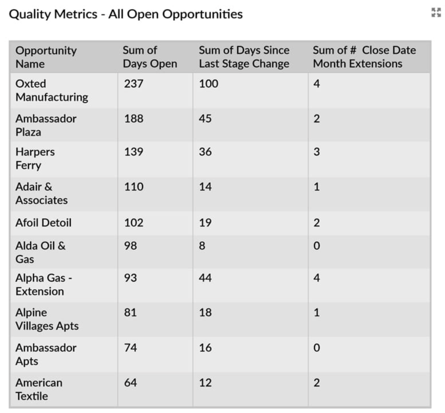
7. Pipeline Quality Metrics
Overview
This chart captures the health of your pipeline through key metrics like stage aging, win percentage, and deal velocity. The chart typically plots Opportunity Age or Cycle Time on the X-axis and win percentages on the Y-axis, grouped by Opportunity Stage.
Pain Points Solved
Improving Forecast Accuracy: Separates viable deals from fluff by focusing on measurable quality indicators.
Addressing Stalled Deals: Highlights deals that are too long in a specific stage.
Increasing Productivity: Identifies inefficiencies in the sales process, encouraging faster deal closures.
8. Opportunity Win Rates
Overview
This chart calculates win rates (also known as conversion rates) by dividing the number of Closed Won deals by the total number of Closed opportunities in a given period. The X-axis displays Opportunity Stages, with the Y-axis showing Win Percentage grouped by Opportunity Owner or Team.
Pain Points Solved
Assessing Sales Effectiveness: Tracks how effective the team is in closing deals.
Flagging Coaching Needs: Identifies reps or teams with low conversion rates who may benefit from training.
Evaluating Lead Quality: Tests whether incoming opportunities are a good fit for your offerings.

9. Average Won Deal Size per Salesperson
Overview
This KPI chart tracks the average dollar value of successfully closed deals. The X-axis represents Opportunity Owners, Teams, or Territories, while the Y-axis visualizes the Average Revenue for Closed Won deals.
Pain Points Solved
Tracking Pricing and Discounting Trends: Reveals if deal sizes are being impacted by excessive discounting.
Segmenting Market Potential: Helps gauge if certain territories are generating better results than others.
Setting Realistic Targets: Averages provide benchmarks for future deals.

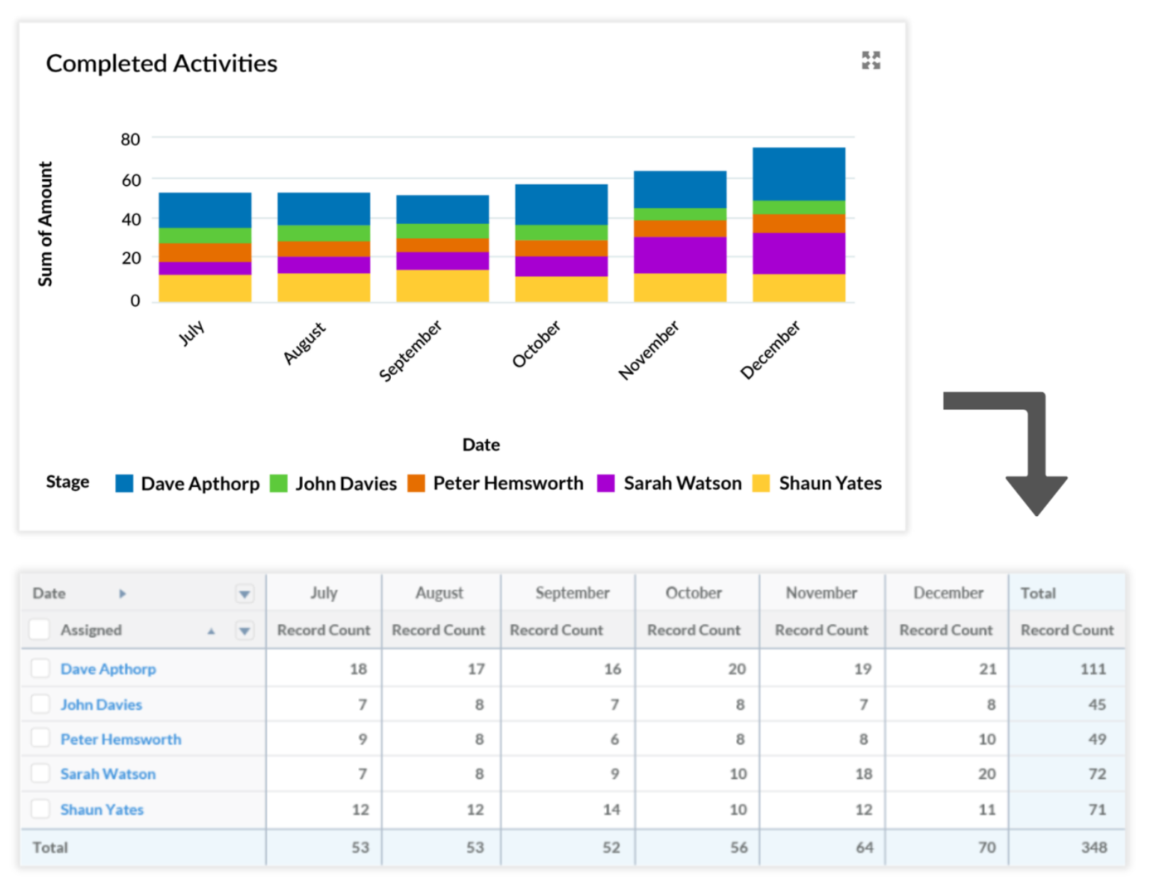
10. Completed Activities per Salesperson
Overview
This chart tracks the volume of sales activities (emails, calls, meetings) each rep completes within a specific timeframe. The X-axis lists Salespeople, while the Y-axis represents Activity Counts, broken into activity types such as Calls or Meetings.
Pain Points Solved
Measuring Sales Engagement: Shows whether reps are actively working on moving deals forward.
Highlighting the Effort-to-Results Gap: Uncovers cases where high activity levels don’t translate into revenue.
Ensuring Accountability: Keeps reps motivated to stay on top of their outreach.
11. Pipeline Leakage
Overview
This chart highlights where deals are lost at each stage of the sales cycle. The X-axis represents Opportunity Stages, the Y-axis shows the Loss Count, and grouping is based on Opportunity Owner or Team.
Pain Points Solved
Spotting High Drop-Off Points: Pinpoints stages where deals fall through too often.
Improving Qualification: Suggests areas to refine lead qualification processes.
Boosting Stage Transitions: Guides efforts to streamline movement between stages.


12. Sales Performance vs. Target
Overview
This chart compares actual sales revenue and pipeline size against set goals or quotas. The X-axis visualizes Opportunity Close Dates, while the Y-axis shows Revenue or Pipeline Values against defined Targets. It can easily be cloned to show Pipeline Coverage.
Pain Points Solved
Setting Realistic Goals: Tests if the current pipeline can realistically meet future revenue targets.
Driving Accountability: Keeps teams focused on aligning their pipeline with goals.
Identifying Growth Areas: Outlines where additional resources or focus may be needed.
Enable Data-Driven Wins
The right dashboard charts offer clarity, enabling smarter decisions and sharper focus.
Use these 12 essential charts to simplify your reviews, pinpoint opportunities, and drive your teams toward real, measurable success.

